12 Tips & Examples
Web Design Guide
A beginners guide to design a practical yet stunning website.
Tip #1 – Choose 1 Font
Each font has it’s own personality and feeling, so choose one that most represents your brand.
By using Whatfont (Google Chrome extension) you can see what other sites use.
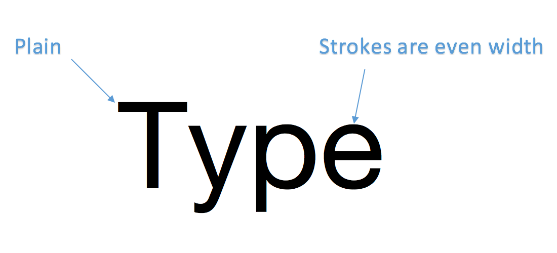
SAN SERIF
Montserrat
Open Sans
Lato
Roboto
Raleway
Simple, Clean and Modern. Most websites use this typeface.
How to Use:
If you are starting out, you can’t go wrong with one of the above fonts. Use font size & font weight to differientate.
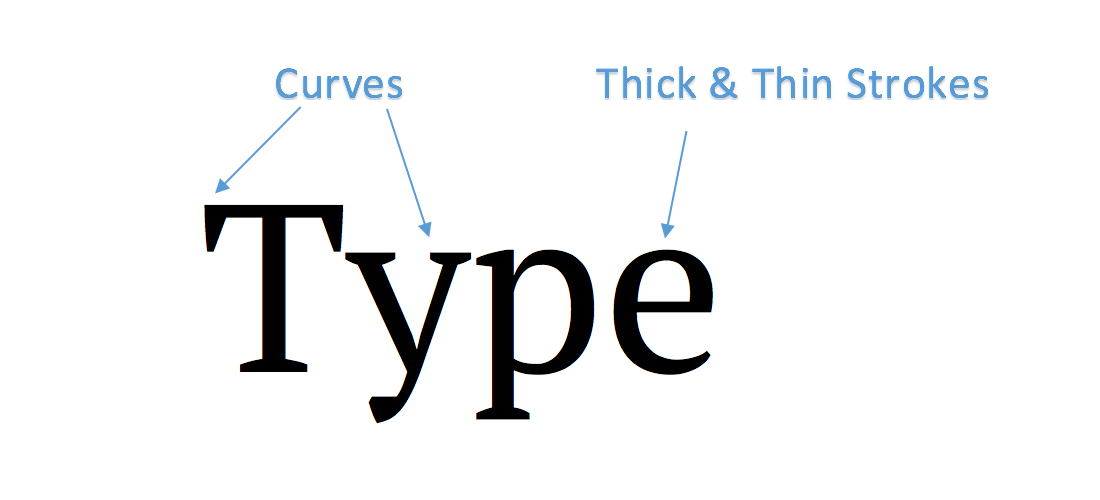
SERIF
Playfair Display
Merriweather
Pt Serif
Crimson Text
Traditional, Elegant & Handcrafted Look.
Also good for long reading, such as blogs.
How to Use:
Use it for Headings or Logo’s
Body Text/Main Navigation use a San Serif
Tip #2 – Body Font Size
Keep it between 14-18 px for paragraphs
12px
Lorem ipsum dolor sit amet, consectetur adipiscing elit. Duis nec orci odio. In vitae lectus ac tortor vehicula eleifend. Donec pharetra mattis magna, et pellentesque nulla pharetra vel. In eu blandit magna.
16px
Lorem ipsum dolor sit amet, consectetur adipiscing elit. Duis nec orci odio. In vitae lectus ac tortor vehicula eleifend. Donec pharetra mattis magna, et pellentesque nulla pharetra vel. In eu blandit magna.
25px
Lorem ipsum dolor sit amet, consectetur adipiscing elit. Duis nec orci odio. In vitae lectus ac tortor vehicula eleifend. Donec pharetra mattis magna, et pellentesque nulla pharetra vel. In eu blandit magna.
Tip #3 – Line Length
Use 45-90 characters per line for an easy read.
(especially if you have alot of text)
Bad
Lorem ipsum dolor sit amet, consectetur adipiscing elit. Fusce rutrum consequat sollicitudin. Donec malesuada accumsan mauris in faucibus. Curabitur lobortis felis vel felis dapibus dictum. Pellentesque posuere, erat eget tempus tincidunt, tellus arcu pellentesque nisl, lacinia vehicula est nunc a lectus. Donec semper ligula a purus fringilla varius. Quisque ut nisi dui. Maecenas libero eros, sagittis quis dui in, tristique dignissim sapien. Sed vel dui ornare, varius massa sed, scelerisque libero. Quisque dignissim sapien id augue efficitur lobortis sed at eros. Quisque vitae volutpat ex. Suspendisse in egestas turpis.
Good
Lorem ipsum dolor sit amet, consectetur adipiscing elit. Fusce rutrum consequat sollicitudin. Donec malesuada accumsan mauris in faucibus. Curabitur lobortis felis vel felis dapibus dictum. Pellentesque posuere, erat eget tempus tincidunt, tellus arcu pellentesque nisl, lacinia vehicula est nunc a lectus.
Lorem ipsum dolor sit amet, consectetur adipiscing elit. Fusce rutrum consequat sollicitudin. Donec malesuada accumsan mauris in faucibus. Curabitur lobortis felis vel felis dapibus dictum. Pellentesque posuere, erat eget tempus tincidunt, tellus arcu pellentesque nisl, lacinia vehicula est nunc a lectus.
Tip #4 -Text Hierarchy
Define hierarchy by reducing font size, font weight or colour.
Before
Create an Amazing Headline
Design an “app like” mobile responsive website.
Design
A better user experience for you
You can add a top heading like the one above.
Marketing
Develop an effective search engine strategy
You can desaturate & capitalise the text like this.
After
Create an Amazing Headline
Design an “app like” mobile responsive website.
Design
A better user experience for you
Reduced font weight, add colour & increase letter spacing.
Marketing
Develop an effective search engine strategy
You can desaturate & capitalise the text like this.
Tip #5 – Choose 1 Accent Colour
Keep it simple and choose only one colour, but use shades of the same colour.
This is a monochromatic colour scheme and is an easy way for beginners to ensure website always looks good!
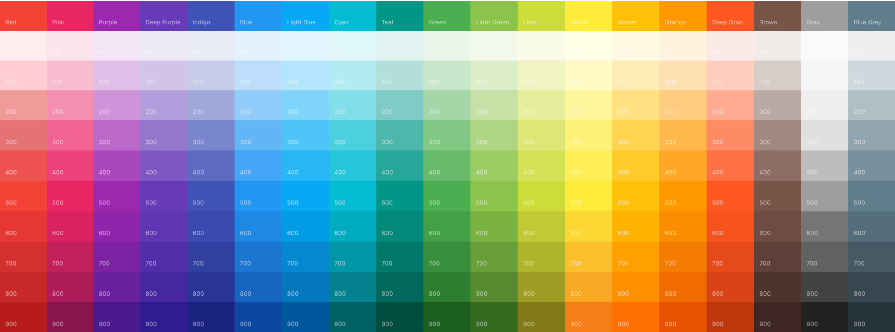
Pick a colour here: https://www.materialui.co/colors
Alternatively, pick an image you like from unsplash and upload to adobe for a colour palette.
Tip #6 – Use Neutral Colours
Can be used to seperate content, header, footer & anywhere you don’t know which colour to use.
Tip #8 – Picking the Right Image
Using the right image can make or break a website.
Step 1
Choose an image to support your text.
Step 2
Does the image reflect the style of your website? i.e. Minimal? Expensive? Happy?
Step 3
Is your image large enough? see size guidelines below. If not, improve quality here.
Places to find images: Unsplash or Adobe Stock/Shutterstock
Tip #9 – How to Add Text Over Images
Always ensure your text is readable by using several techniques shown below.
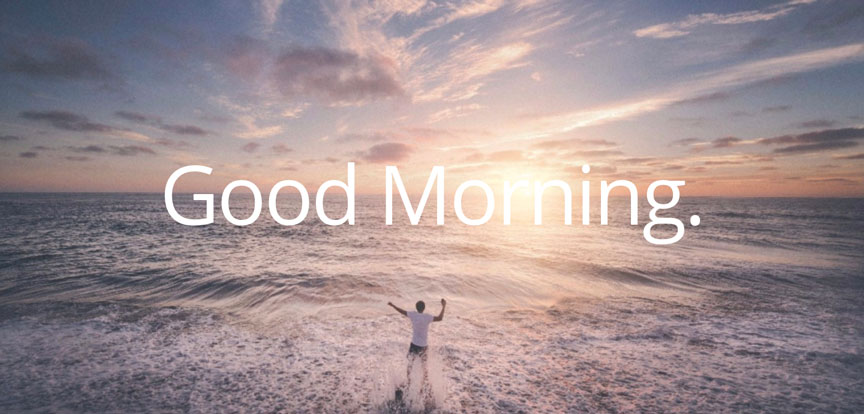
Normal Image with Text Overlay
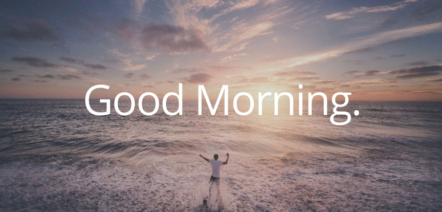
Added 15% Opacity Colour Overlay

Normal Image with Text Overlay

Change Positioning and Added Colour Overlay

Change Positioning and Added Blur Effect
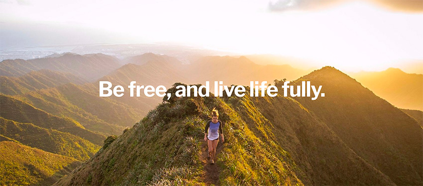
Normal Image with Text Overlay

Add Background to Text

PayPal Example
Note: Not every image may be perfect, so it may need some adjusting.
9. Image Size Guide
Images directly from websites/cameras might be too big e.g (5000 x 3000px) hence when uploaded to site, it would load slowly.
Below are some guidelines to help you decide what to crop them as before uploading to your website.
1. You can find images at thestocks which compiles all the good sites all in one place!
2. You can crop & edit your images for free on fotor.com

Small (JPG)

Medium (JPG)

Large (JPG)
Hero Image
Approx (px) = 1800 x 1000
Size (KB) < 400KB
Saved Format = JPG
10. Product Images
All uploaded sizes should be around be 800 x 800 px
Keep it proportional
White background recommended
If page loads x10 Images at 287KB each = 2.87MB
Whereas x10 Images at 61 KB each = 610 KB
Note: For non feature images you can use images which have a background and may show the product in use. As this doesn’t show/load on main shop page.
Tip #11 – Alignment, Spacing & Separation
1. Try to align things where possible.
2. Ensure spacing is even. And using white space can make your website appear more simple and clean.
3. Use neutral colours, background images and divider lines to separate content.
Tip #12 – Focus on Simplicity & Consistency
There are many tools, plugins, themes with all sorts of features but 80% of the time we don’t need to use them.
Just focus on the basic elements such as the text, images and colours.
Follow the guidelines above and you should have a great website.
Don’t need to be fancy, focus on readability and also on creating useful content.
My Favourite: You can use a chrome extension called Full Screen Capture to screenshot entire webpages for inspiration.
Use it to also screenshot your own webpage to see if everything is consistent.

